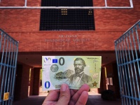
First American banknote limited edition in the USA done by Rotary Scottsdale in the State of Arizona
1. Check whether it is possible to do the EU flag (or any other flag such as the Union Jack) in the offset process. Alexandra Metzen already has explained to me that the EURO flag is allowed when the number is ‘0’ but any other given number such as ‘1492’ is EURO flag is prohibited or another flag is required. I will add my idea for a particular universal flag within this briefing which ‘could to the trick’

2. Inspired on the Dutch banknote designer Ootje Oxenaar and his designs for the EURO competition (which he lost because his Austrian competitor was in favour) I have made the head and footer bar plain white with a slight color gradient. This makes gives the design somewhat more rest.
3. If possible, please add the definitive chose holographic foil motiv since to my knowledge this is the one used within the first draft.
4. The micro pattern is more detailed and bears more squares and rectangles. I will add the chosen patterns into one file so the design department of KJE (Mike Vos) will have them at his disposal.
5. Instead of a circled pattern, a guilloche flower would we be preferable to our opinion.
6. The footer bar is the same like the header bar, inspired on the EURO design by former KJE designer Ootje Oxenaar.
7. The header and the footer bar are plain white and one could think of adding a slight but only a slight color gradient to it, just like Oxenaar’s design.
8. In the front and in the back, we would recommend in seeing ‘stars’ back within the design, maybe slightly dissolved or watermarked but we would recommend in seeing them back since they are also to be seen in the current Memo Euro design.
9. We love and welcome the idea with the ‘6 star’ version and when one looks closer, one would see 12 stars. We recommend of only using them in de backside of the design on that particular spot.
10. We love the typical way KJE puts in the serialnumber and we would welcome to if possible add the serialnumber on the back instead of the front on that excact spot.
11. We love ‘The Fleischmann – music bar – dedicated to +300 years KJE history) a lot and we suggest just like the Euro designs from Ootje Oxenaar to also see them at the back of the banknote.
12. The background pattern bears to much circles and we would prefer to use a pattern which resembles the current Memo Euro designs since we designate to put landmarks to the background as we did with banknotes like Turkey and Israel.
13. We have given it consideration to test a few models, the familiar 0 one but also looking to 4 to max. 5 numbers just as an example how it would look like on the front and on the back of the banknote.
14. The footer bar is white and one could think of adding a slight gradient to it but nothing more I would suggest.
MICROTEXT
We would suggest putting something with a teasing historical text as microtext and these would be the following words, sentences and numbers:
‘NE TROP HAUT, NE TROP PAS’ (famous quote KJE)
EUROSCOPE (issuer)
IZAAK ENSCHEDE (founder)
WPPERTAL (founding place of EUROSCOPE)
HAARLEM (founding place KJE)
R.D.E. OXENAAR (homage to one of the best banknote designers in the world)
1814 (start KJE)
2021 (year of this design)
###


